Today’s #TipTuesday is for new users, and it could be a very helpful one. This post is all about options to make “required” fields in Dynamics GP more visible to users, a feature that is easily overlooked in training.
User Preferences
In a post last summer, I covered some of the User Preferences window, but I didn’t go as far as covering what is under the Display button. This post covers that particular area of User Preferences.
First, go to the User Preferences window. By default, there is a shortcut to this window on the Home page shortcut bar (left-hand side). If it’s been removed from there, it is also on the Microsoft Dynamics GP menu, near the bottom of the list of menu items.
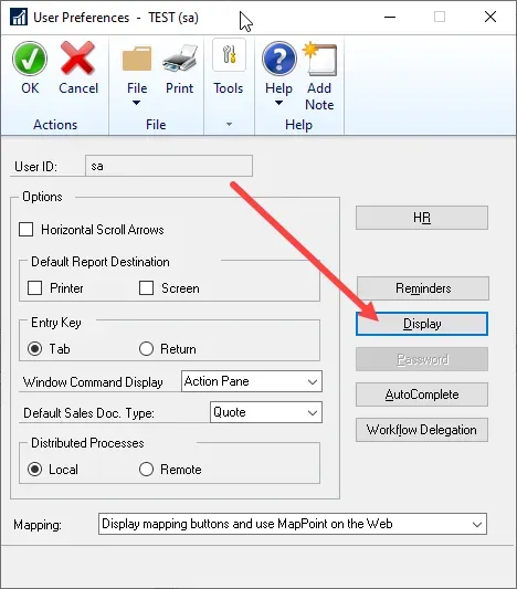
Once there, click on Display.
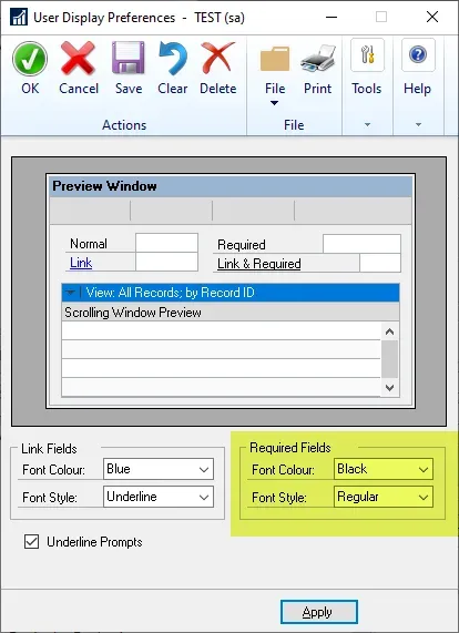
The default user setup will display Required Fields in Black, Regular style, which means there is no differentiation between a Required field and an Optional one. There aren’t many choices in the Display window, the colour can be Black or Red, and the style can be Regular or Bold. I recommend that every user set their required fields to Red and Bold for optimum visibility.
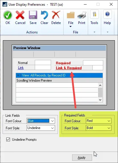
What’s the difference?
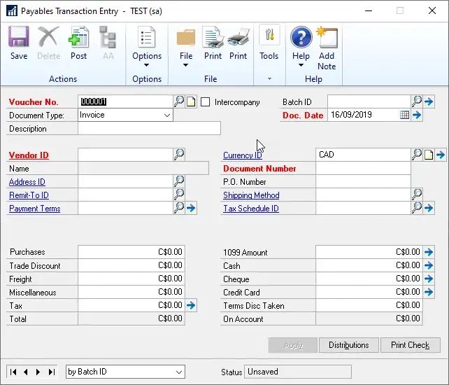
As an example, here is what the Payables Transaction Entry window looks like, with the default display settings. Without visual differentiation, the user has no idea what fields must be completed to save a Payables transaction.
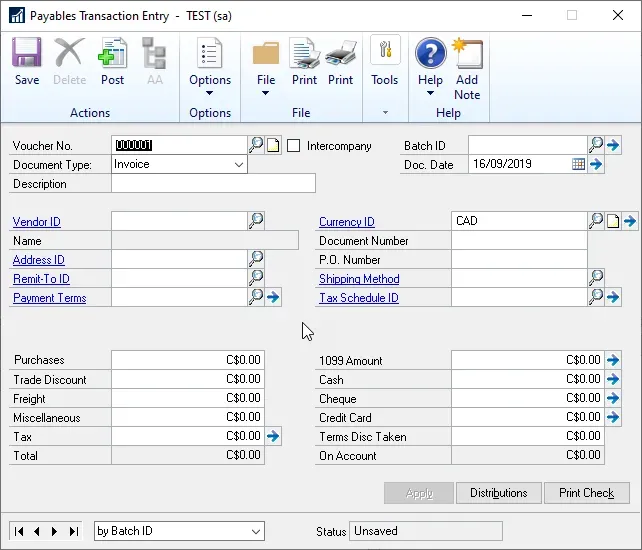
Here is what the Payables Transaction Entry window looks like after these display settings are in effect. Now it is much more clear to the user what fields must be completed/filled out.
Caveat
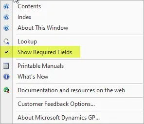
On some systems, there is one more thing a user may need to do to show the Required Fields and that is check the “Show Required Fields” setting under Help. By default, it usually has a checkmark beside it, as shown in my screenshot below, but it might not show this on all systems. Clicking on it will mark it again. Each time a user clicks on it, it toggles between enabling and disabling the Required Fields. This menu is on the Help button on any screen in Dynamics GP or the main Help icon on the top right of the home page.
That’s it for now. For anyone responsible for setting up or training new users in their organization, remember to teach them this setting!