Way back in February 2011 (yikes!), I wrote about some Report Writer toolbox items and focused on the Arrange tab of tools. Today, at long last, I am concluding that article with some notes and tips on the drawing options (most font options), hopefully clearing up some mysteries.
What are Drawing Options?
These are the options one gets when either double-clicking on a text field or graphic field like a line or a box, or using CTRL+D on a data field. There are several pieces to it and options that authors have. Here I will describe how they work and how to use them effectively.
My article on formatting text may be a good place to start which gives some info I will not be covering today.
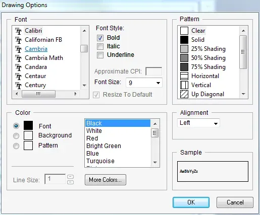
When opening the Drawing Options window, what is there will differ depending on whether this window was opened from a text field, a data field or a graphic (line, box etc.) field. This screenshot is from a graphical report that I’ve been modifying in this series. When in a Text report, every Drawing option is greyed out.
One tip before I start, when making the same change to a bunch of fields, select multiple fields at the same time and then change the drawing options at once. That speeds things up when doing a bunch of similar changes. Use the Lasso or Ctrl-Click methods I mentioned in my earlier post about formatting text.
The Font section
The top left corner lists all of the fonts available on this computer. It’s barely visible in this picture, but the font I’m using happens to be Calibri, which is highlighted. The symbol beside the font just indicates what kind of font it is – TT meaning True Type. The standard text formatting options are available under Font Style of Bold, Italic and Underline. Font size is a drop-down list. TIP: one can also type in a font size. From time to time I have had to drop to a font size smaller than the smallest available and simply clicking in the box to type in the value I want works.
A few words of caution when selecting fonts and styles:
- Pick a common font. Don’t want to pick a special corporate font to find out that most computers don’t have it loaded and the reports don’t print as intended!
- Every font has different character sizes and kerning (spacing). Depending on what kind of report, some fonts are easier to read than others, and fit in certain size fields better than others. The more text on the report, the more I recommend sticking with a font that takes up a little less horizontal space than others.
- Go easy on the bold & italics! Lots of either are often harder to read than not having them at all.
- Font size can make or break a report. On the one hand, the goal is to fit all the information on the page right? Try to be creative with the placement of fields to avoid having to make a font choice so small it’s unreadable.
- When testing the report, try to ensure that fields with descriptions contain suitably long names or descriptions in them, to see what fits when a field has the maximum typed in it.
- Lastly, on more of a design note, try to be consistent. If using a large font for a set of headings, use the same size for all of them. Nothing worse than looking at a report that uses inconsistent sizes of fonts and styles all over!
Colours & Patterns sections (revised!)
I’ve re-written this section of the article, after a conversation with a reader of the blog and some more testing to clarify a few things. Now I can say the colour is more interesting! (And yes, I will insist on spelling it “Colour” since I am proudly Canadian!).
My light bulb moment: something I didn’t clue into before I did some more testing, authors can select ONE pattern in the upper right-hand corner. It’s not one pattern per colour choice, it’s not solid for fonts, shading for background and then a pattern. Uh uh. One. Pattern. Period. Here is how the choice of Pattern (upper right) affects what options are in the Colour (bottom left) section:
- Clear
- No background or foreground colour options.
- This does not affect the text or line colour choices.
- Solid
- Background colours are enabled.
- Shading “Pattern” (25%, 50%, 75%)
- Background and Pattern (foreground) colours are enabled.
- The shading terminology is directly related to the Pattern colour choice. For instance, if the Background “colour” is White, when selecting a Pattern colour, 25% shading means exactly what I would expect: 25% of the colour chosen.
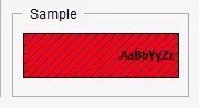
- You can select two colours (one background, one foreground) to create a new colour (think of a primary school colour wheel experiment: red and blue make purple!).
- The other patterns
- Background and Pattern (foreground) colours are enabled.
- The Background colour is a solid colour of whatever colour is selected. The Pattern colour is the foreground colour of the pattern – for instance, the lines on the diagonal pattern.
Back to my regularly scheduled article!
Here is the rest of my article, with the now-redundant pieces removed!
Starting simply with the colour options, select a default colour from the list. The Sample box shows the user visually what it might look like. Often I’ll increase the font size just to get a larger sample preview when playing with colour options. Click on the More Colors button to get a broader palette to choose from and to go even further to define custom colours. To use the organization’s corporate colours for some titles, the author needs to know the equivalent HSL or RGB values of that colour. To save the colours, click on Add to Custom Colours and they appear at the bottom of the More Colors list.
TIP: Typically corporate colours are most commonly one of two types of values – a Pantone colour reference (PMS 109) or if it’s from a website, a Hex value like FF6633 (a beautiful colour of orange!). Use a search engine to look up “Pantone to RGB” or “Hex to RGB”, there are a bunch of websites that help find the right values.
Now that colours are selected, the trick is to select the radio button of the thing to change first. It defaults to Font (or Line), so if nothing is selected and the colour is changed, the effect is changing the colour of the line or text. The background option is the background of that specific object, not the page background.
Here is an example of an object with a red background and a blue Up Diagonal pattern – the diagonal lines are blue since the Pattern colour is the foreground colour.
Alignment
The last of the sections is the Alignment section. Alignment doesn’t affect all types of fields. Also, the data fields visually in Report Writer do not change when this setting is changed, the report needs to be run to see the change. Often data fields have their own alignment in the formatting section of the Report Field Options window which will override what the Drawing Options setting is. For text fields and some data fields, choose Left, Center or Right justified.
Line Sizes & Colours
The one option that is greyed out when looking at Text drawing options is Line size. Once a Line, Box, Circle or similar graphic is selected, the Line section is enabled. There are four thicknesses of lines available. Colours can also be selected for lines but Background and Patterns are greyed out.
General Notes on Layers, Boxes & Backgrounds
Design-wise I tend to avoid using backgrounds on text and insert background boxes if I would like a shaded background. This allows me to size the background as appropriate without also altering the dimensions of the text field(s). One tip: remember the layers! Under the Layout menu, there is a Send to Back and Send to Front command. This works well to hide or unhide things as one can easily put in a box, “send to back” so it’s behind the text. Use a “clear” background on text, not a solid colour if one thing is on top of another.
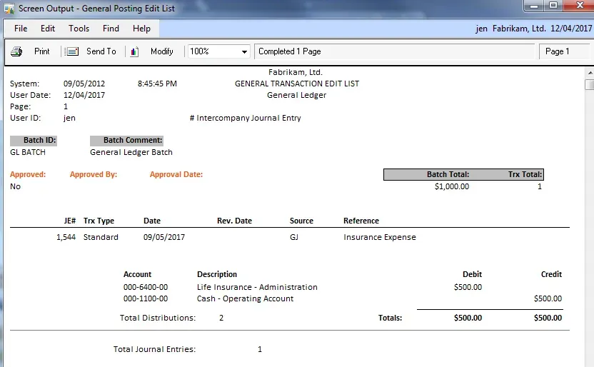
Below is a quick example of the output of a few changes (most of which will be changed back to normal when I’m done!). I’ve got the “approval” section in colour, to highlight it easily for readers. The Batch ID and Batch Comment both have a background colour of Black 25% shading. For comparison, in the Batch Total and Trx Total section, I put a box behind those two fields with the same colour. Personally, that looks better to me than the background colour on a text field.
Next time?
I hesitate to promise more in the Report Writer series but in re-reading my series of articles, I do see some more topics that I can cover… hopefully those won’t take another year to complete!
Until next time…