I’ve been working with Power BI a lot lately on a “passion project” for myself. I’ll be starting to share more about that in the coming days but first I wanted to share a little tip (that I wish we didn’t need!) for sizing columns on Matrix visuals in Power BI.
I’ve read many other posts and suggestions around creating a measure with all “X’s” but they have never worked for me. I’m probably doing something wrong! 😉
The Problem: columns not aligning nicely
The scenario I had was two visuals with identical information, displayed in different units of measure (one in hours and one in dollars). I wanted the columns to line up visually when the visuals were stacked above each other. It seems like such a simple request!
This is what a couple of my visuals looked like, with red lines drawn for emphasis. I’ve blurred the data but my headings are not lined up.
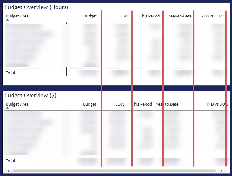
“Before” the hack – columns not in alignment
The Solution
What I’m about to describe I had already done on the top visual initially and realized I should share this hack. (And yes, it is a hack!) This suggestion will work for other similar scenarios such as wanting to have the column widths equal for all columns.
TL;DR version
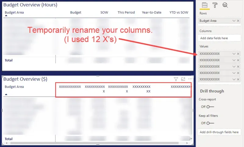
The steps I performed are:
- Rename each column with a text string the width I wanted the columns to be.
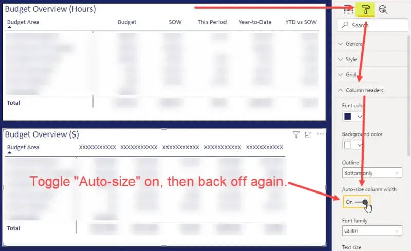
- Turn on Auto-size Column Width under Column Headers, then turn it off again.
- Rename the columns back the way I wanted.
Step 1 – renamed the columns with X’s
In this example, I used 12 “X’s” to get the width I wanted here. It doesn’t have to be an “X”. The intent is to put in a text string wider than the width the column should be, temporarily. Figure out what the widest column values are and make sure the width is larger than that (or larger than the largest value expected in the data).
💡Tip: take a screenshot before renaming the columns with what the names were before in case it is needed.
Notice how some columns are wrapped text? Don’t worry about that, this will be corrected in Step 2.
Step 1 – rename columns with X’s
Step 2 – Toggle Auto-size Column Width
With the matrix visual selected, go to the Formatting tab, expand Column Headers, and temporarily turn on “Auto-size column width”. If that is on already, and the columns aren’t auto-sized, toggle it off and on again.
In the screenshot, any columns that were wrapped before are not, and all columns are sized to the width of the X’s. The first column got resized too, so I just manually dragged that back to the width I wanted. (I intended to put X’s on that but forgot for this example!)
Before going to Step 3, turn “Auto-size column width” off to avoid having the column sizes change as data refreshes.
Step 2 – auto-size columns enabled
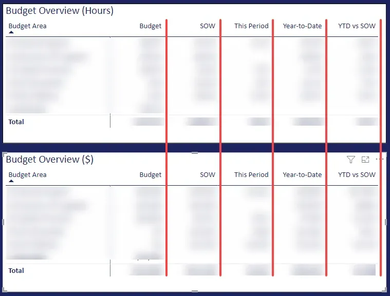
Step 3 – Rename column headers back
With “auto-size” disabled, go back to the columns and re-set the headers with names that make sense for the data. The columns will stay at the width set.
Summary
That’s it for this tip. The only thing I might add is I found I did this and got it looking as I wanted. However, I then proceeded with other changes to the visual that forced me to do it again. Do this last, after the content is finalized!