Now that most of the payroll year-end tax update season is behind us, it’s back to the Report Writer series of articles.
Who is sick of looking at ugly plain-text edit lists and searching for the information to be reviewed? Have no fear, more useful and attractive reports are a few mouse clicks away!
Lots of users have gone to other reporting tools to get better-looking reports and I don’t blame them. Crystal and SQL Reporting Services give us a lot of great tools to improve reporting in terms of look and feel as well as flexibility of layout and many other benefits. As much as some of us would like Report Writer to die a slow death, the reality is for posting journals and edit lists and anything with temp tables, Report Writer is “it”.
So, there are two choices: put up with the out-of-the-box ugly reports or make some reports more visually appealing, enhancing the fields which are of importance. The next 2-3 articles will be focussed on how to spruce up reports, using an example of modifying the General Posting Edit List, converting it from text to graphical and cleaning it up.
First, those who are new to Report Writer, take a moment to review my background posts to get up to speed.
- Report Writer Demystified Part 1: Dictionaries and Launch Files
- Report Writer Demystified Part 2: Other considerations
- Report Writer Series: Formatting Text
Begin with the end in mind
With a nod to Stephen Covey, who I believe coined this phrase, best practices dictate having a goal in mind when starting a project. Well, with report writing, the same principle applies: don’t start until it’s clear what the end target is. This usually means “mocking up” a report.
What are mock-ups?
By “mocking up”, I mean printing out a sample of a report to be edited. It’s best to ensure the report mock-up represents the typical information that is printed on the report. I.E., ensure printing samples that contain all the typical fields that would be used in the course of ordinary transactions. Also, don’t limit it to “one” of anything – try to have a large enough sample that the report is more than one page. Why? The Page Header often is not displayed on page 1 of a report and an author doesn’t know what the report fully looks like until they print a two-page or more report.
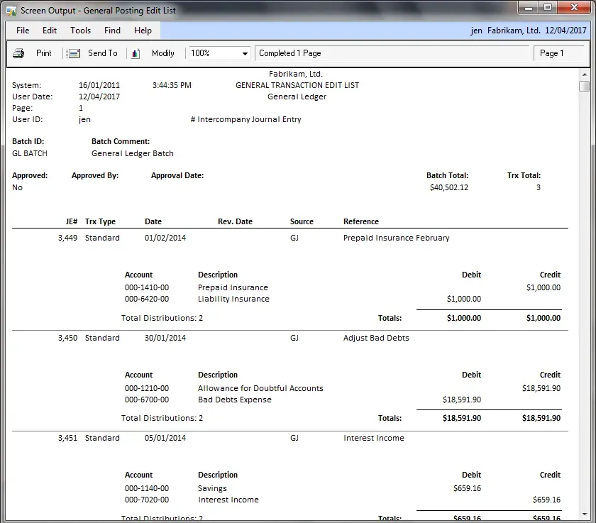
Example of a mock-up
Pictured below is a mock-up of the report I plan to modify. I’m circling fields I want to move or edit in some way and drawing in new items that I want to be added. In this example I am not removing any fields however that is very common, and putting a big “X” through the fields and field titles to be removed is an important part of the mock-up exercise. Usually, the client or end-users are doing the mock-ups and in those scenarios, ensure their scribbles and notations are clear in case anything needs further explanation.
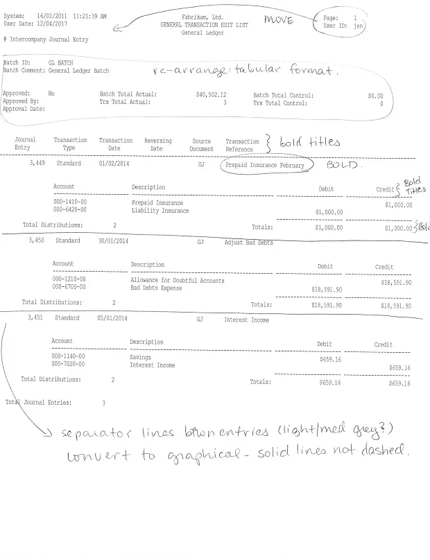
Some people take this a step further and draw these mock-ups up a lot neater than mine, or even cut and paste the fields on a blank page the way they want them to appear. That’s ok too… the goal is to be clear on what the desired output looks like. Try to avoid the vague “just pretty this up for me” approach to report modification! What I find looks great, may be quite unreadable to someone else!
Here is my process when modifying a report, after I have a mock-up ready, and launching GP pointing to my copies of the reports dictionaries.
Step 1: Check for previous customizations
This may sound obvious, but stranger things have happened. Do a quick check before starting a modification of a report by checking if that report already exists in the reports dictionary. A quick look at the Customization Maintenance window shows everything that is currently modified.
If, by chance, the report to be modified is already listed, do a little digging to find out what the modified version looks like (just in case the mocked-up version is the original) and who, if anyone, is using it (i.e., who has security access to the modified version).
Step 2: Modify the right report!
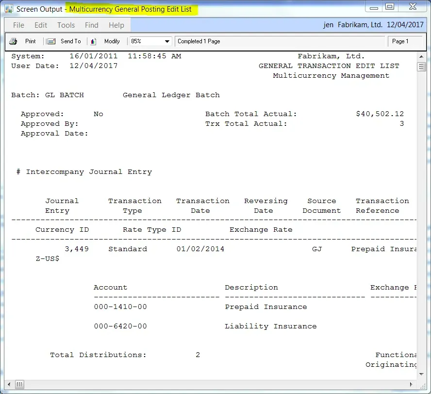
There is a saying, “Good Judgement comes from Experience. Experience comes from Bad Judgement.” I used to modify a report by going into Report Writer then finding the report I wanted and inserting it into my reports list. That seemed to work just fine until one day I spent a great deal of time modifying a posting journal only to find out the client uses the multicurrency version of the posting journal – an entirely different report. I still remember the dull thud sound of my head hitting the desk. Ugh!
Learn from my “experience” and instead of that approach, find the report in GP and print it to screen, then click on Modify to get into Report Writer. Remember, this approach does not work if any reports print after the one to be modified though, but at least in the title bar, it shows the exact name of the report, to find it in Report Writer!
💡 TIP: Don’t go by the name in the Report Destination window! (it’s not the real name, and doesn’t identify if it is a multicurrency version for instance!)
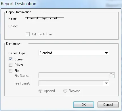
Use the name of the report in the Title Bar instead!
Step 3: Convert from text to graphical
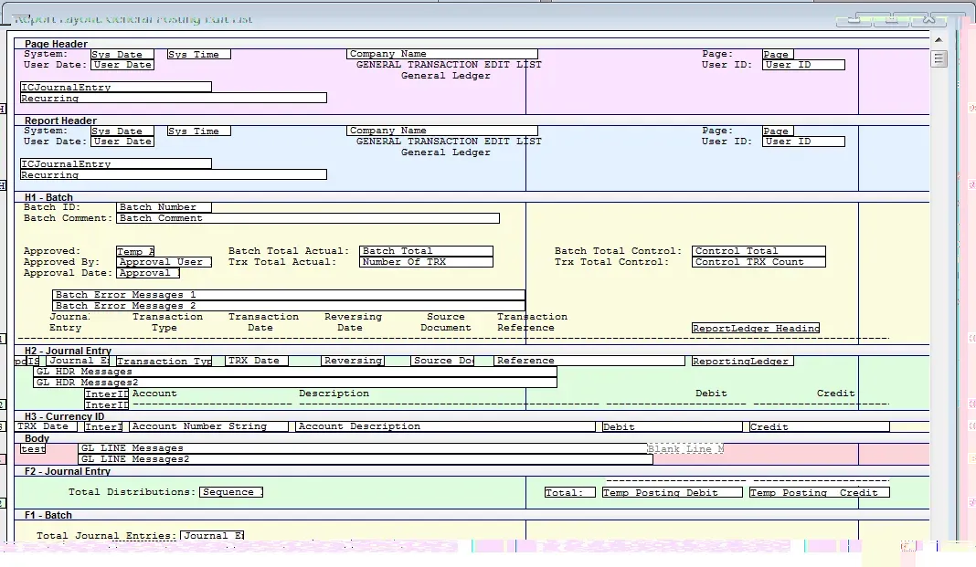
The layout of a text report, for this report, looks like this:
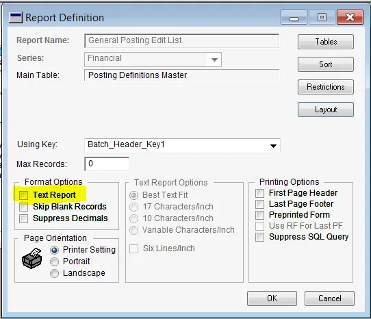
To change it to a graphical report, exit the Layout screen, and unmark the Text Report option on the Report Definition screen.
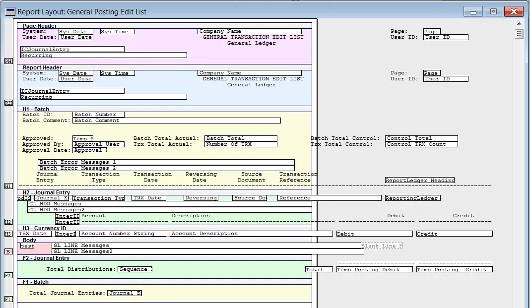
After doing that, the layout will initially look something like this:
Step 4: Start to make changes!
The first thing I usually do is to mass-change the fonts on all of the fields. Select all fields (CTRL+A) and then go into Drawing Options (CTRL+D) and change everything to a more suitable font than Courier 11pt. If graphical elements are added first, then my “select all” approach to changing the font first will be grabbing graphical items like boxes and lines as well as text and the shortcut to mass-change fonts won’t work.
I generally stick with plain fonts for readability – Arial, Helvetica, and Calibri work for me. I also try to get away with small font sizes to make things fit better – 9 or 10 points for most text is often a nice size to work with as long as people can read it. This is purely preliminary – I mass-change to what I want the majority of the font sizes to be and as I get closer to the report being final, I spot-change titles or other fields to different sizes as required.
Next, start moving the fields into place. Moving from text to graphical throws the fields off the page so-to-speak. Consider changing the layout to landscape if the report has more information width-wise than length-wise. Use some of the techniques described in my previous posts about selecting multiple pieces of text to move things around. I usually focus first on getting things to the right general area before finalizing the exact location and aligning things precisely.
Next post, I will continue with this example and show tips on how to use the Toolbox to arrange fields and make the report a thing of beauty! Until then, here is a sneak peek at the result.